Project Overview
VenusHacks 2025 was not only my first hackathon, but my first in-person competition of any kind. With no backend or frontend development experience, I had a clear goal: meet new people and contribute however I could. Early on, a teammate pitched an idea that resonated with me and I wanted to help bring it to life: auther., a platform to spotlight research by women and help close the gender gaps in authorship and visibility.
With only one experienced developer on the team, I stepped into UX design: owning the visual design, branding, secondary research, and guiding teammates through Figma. What began as a learning opportunity ended with our team winning Best Female Empowerment Hack, and for me, a crash course in rapid collaboration and design under pressure.
auther. is a platform designed to make women-led research more discoverable, amplifying the voices that are often overlooked.
Role
Duration
Product Designer
36 hours
Tools & Skills
Figma, User research, Design systems, Visual design
The Crew
Ethan Vo, Kristen, Aaron Jin
160+
Participants
#1
Female Empowerment Hack
33
Projects
Click to interact! Note: The website may take a while to load results.
CHALLENGE #1
Adapting to limited technical skills within the team.
With only one developer on the team and limited full-stack experience across our team members, we delegated tasks based on our strengths. As the sole designer, I led the design process by researching the problem space, developing the visual interface, and supporting a teammate in learning Figma so we could bring the concept to life together.
THE PROBLEM
We did some digging to better understand the problem space: the gender visibility gap in research.
Sources: [1] Ross et al. (2022), [2] Chatterjee & Werner (2021)
2x
more men receive authorship or inventor credit than women (1)
43%
of women report exclusion from authorship despite contributing (1)
50%
of women-led papers were cited less (2)
These websites were major point of inspiration, demonstrating how visibility platforms can uplift historically marginalized groups:
citeblackauthors.com: a platform highlighting research produced by Black researchers, an often underrepresented minority in academia.
disabledwriters.com: a database that connects journal editors to disabled writers to give the disabled community a voice.
Our Inspiration
Based on our secondary research and points of inspiration, we wanted to build something similar for women researchers: a place where their work is easy to find, recognize, and share.
CREATING THE DESIGN SYSTEM
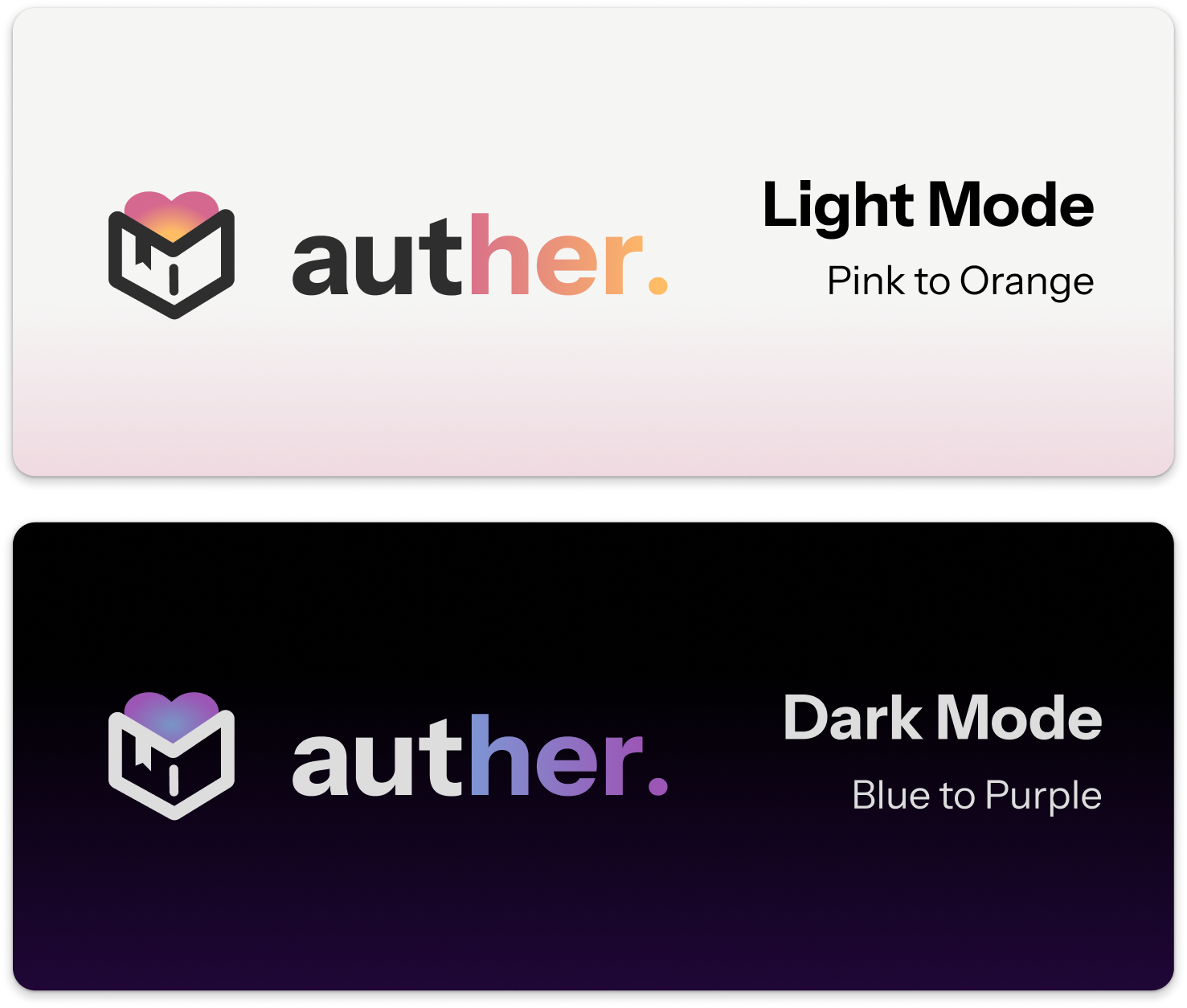
Establishing a modern and approachable brand identity for light and dark modes.
To create an identity that felt modern and approachable, I explored colored gradients, typography, and multiple logo variations in rapid iterations. We wanted to create both light and dark modes to ensure that users could have an engaging and comfortable viewing experience depending on their preferences and accessibility needs.
Ultimately, our design decisions led us to choose:
Pink → yellow gradient (light mode) for energy and optimism
Blue → purple gradient (dark mode) for staying calm and focused.
Lowercase wordmark logo in Instrument Sans for easy readability and approachability
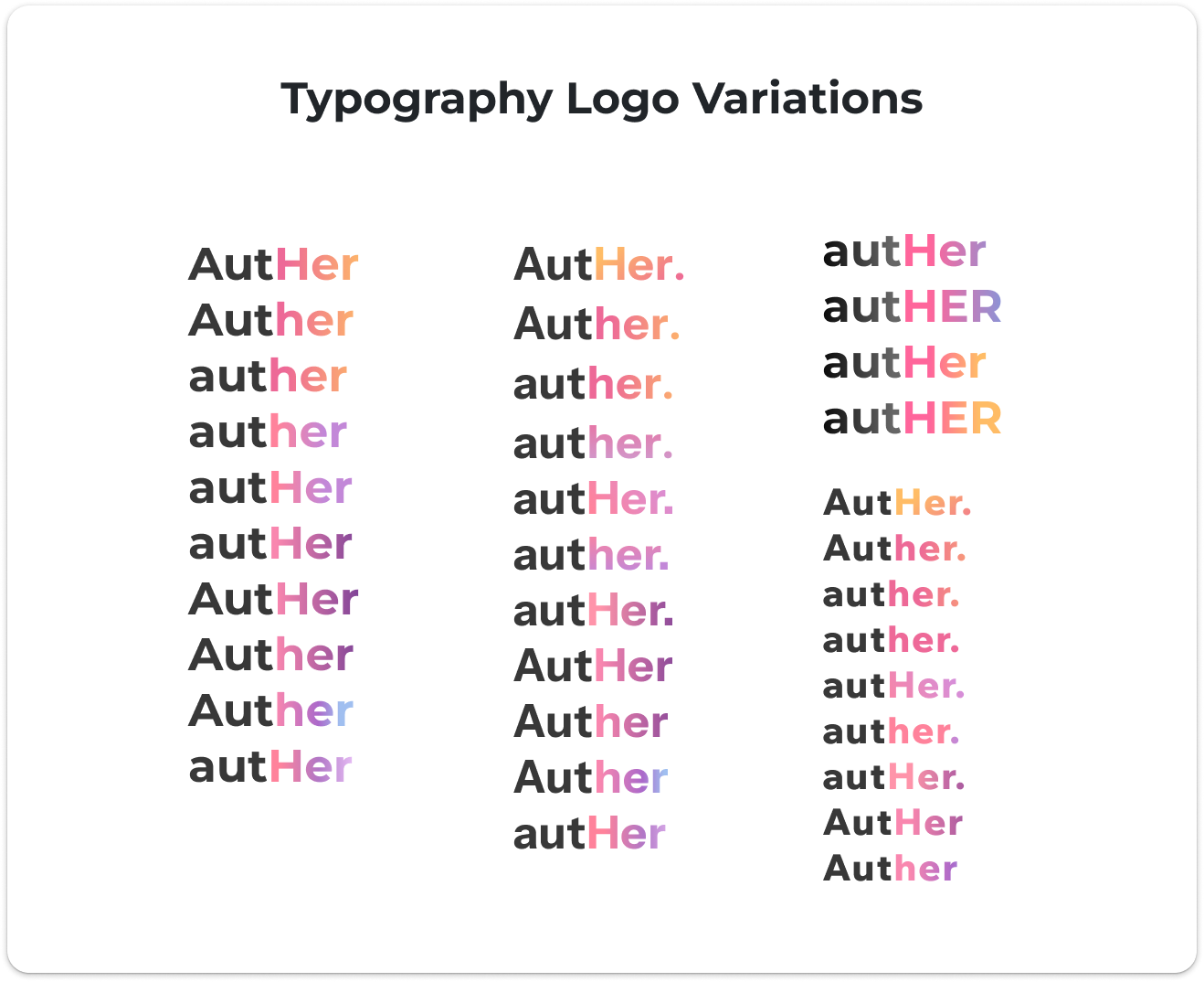
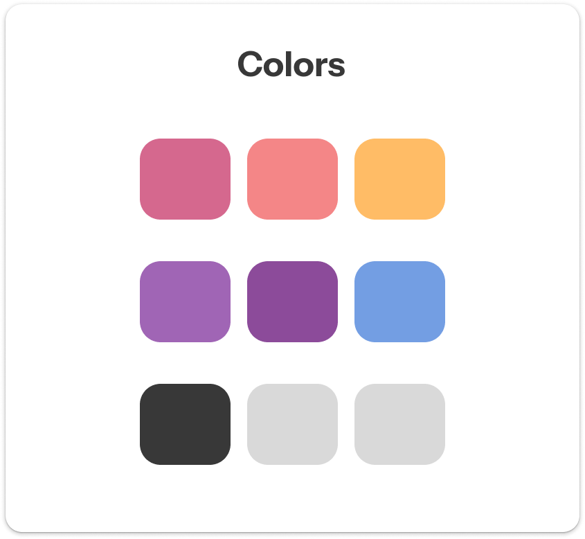
Multiple variations of typography and color palettes
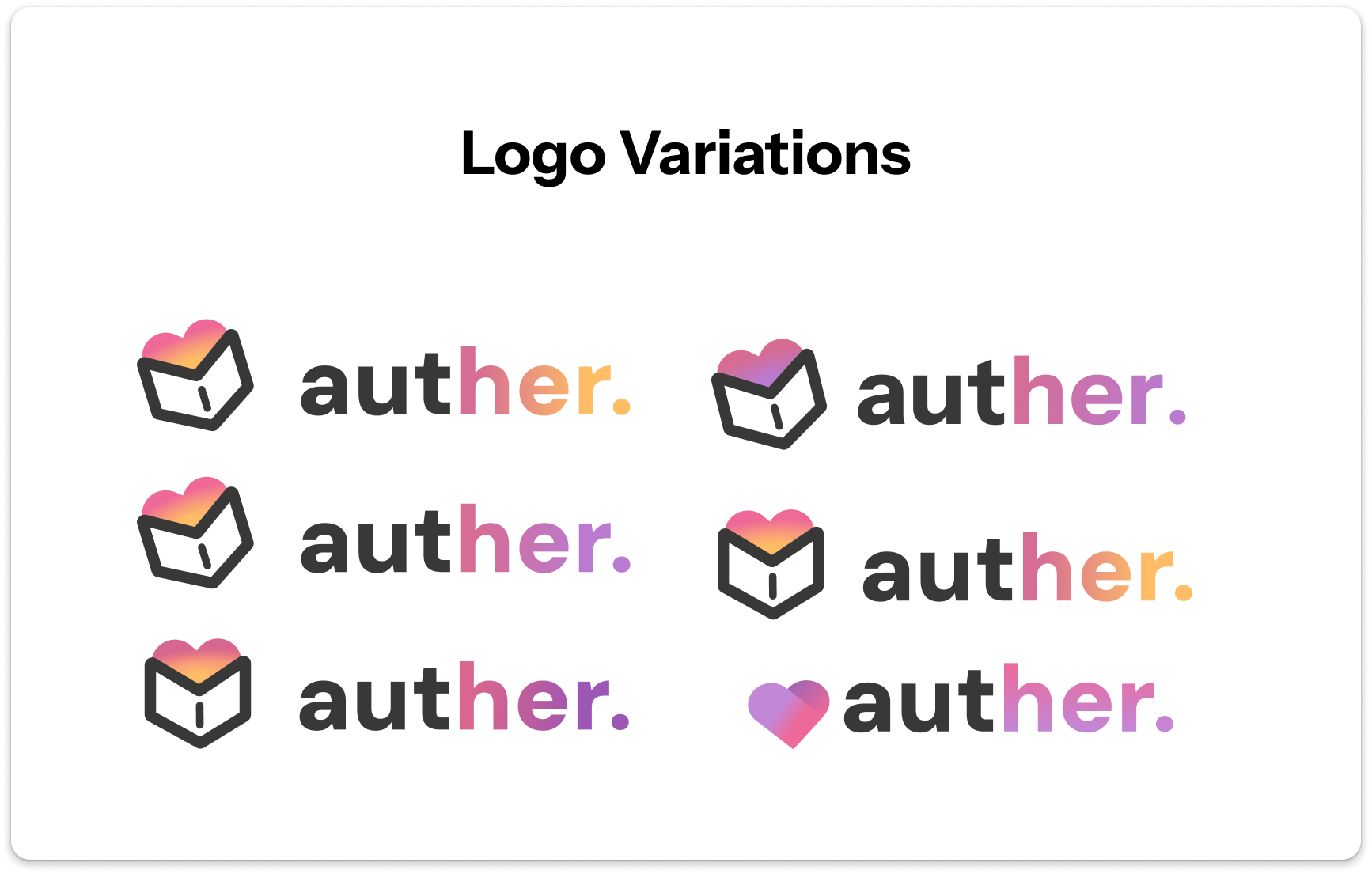
Exploring logo ideas for auther.: an open book
Once we decided on the general color scheme and typography, I began exploring logo ideas to reflect a book, tying into the platform's focus on research and knowledge. I ultimately created a logo with an open book, adding a glowing heart opening from the inside of the book to symbolize inspiration, appreciation, and recognition.
Before
Initial Explorations
After
Final Brand
DESIGNING THE PRODUCT
Designing under time constraints & balancing technical feasibility = PRIORITIZE!
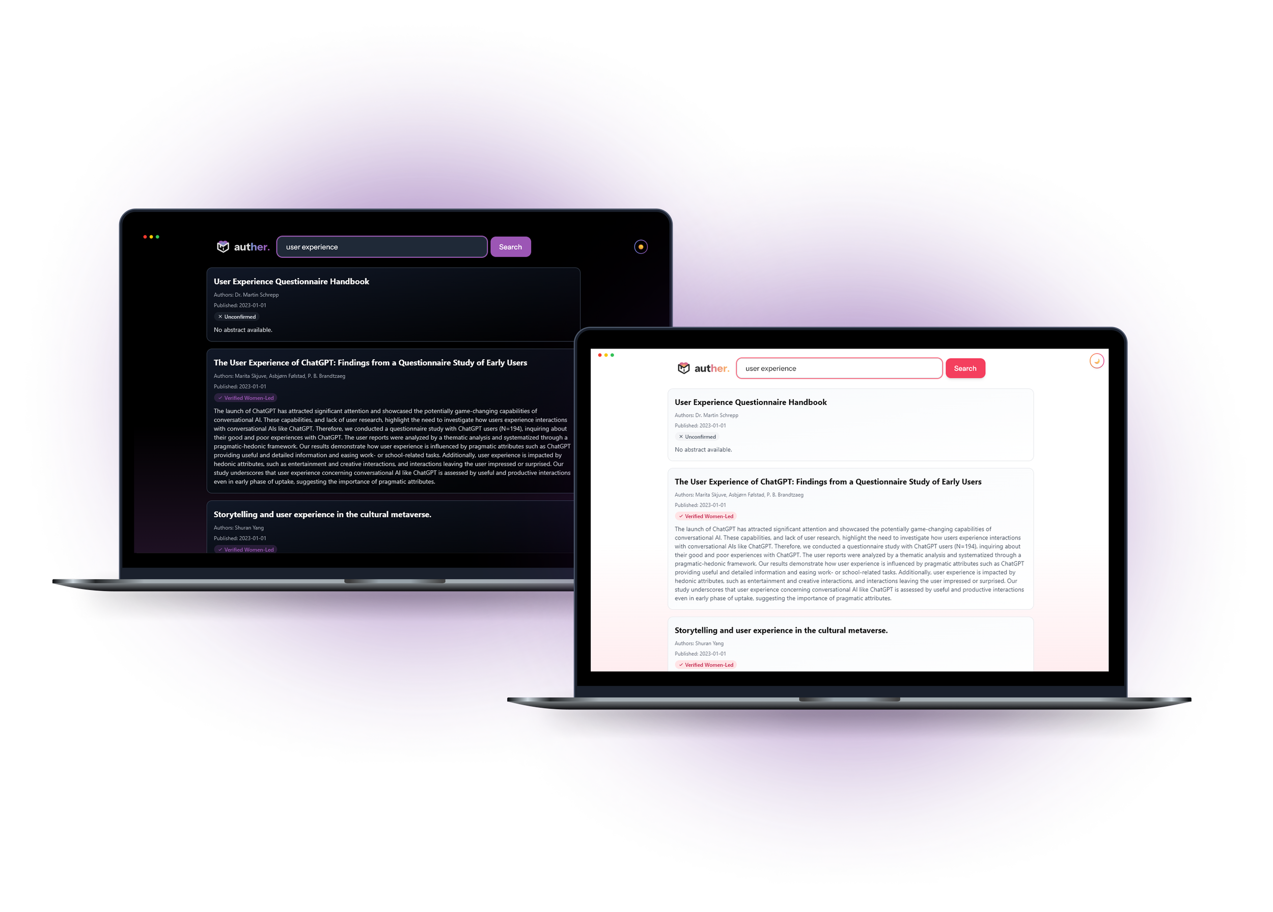
With < 48 hours to complete our project and one developer working on full stack development, our team needed to prioritize. With teammates and guidance from mentors, I created UI mockups for our proposed features: home, search, saved library, profile, and history pages.
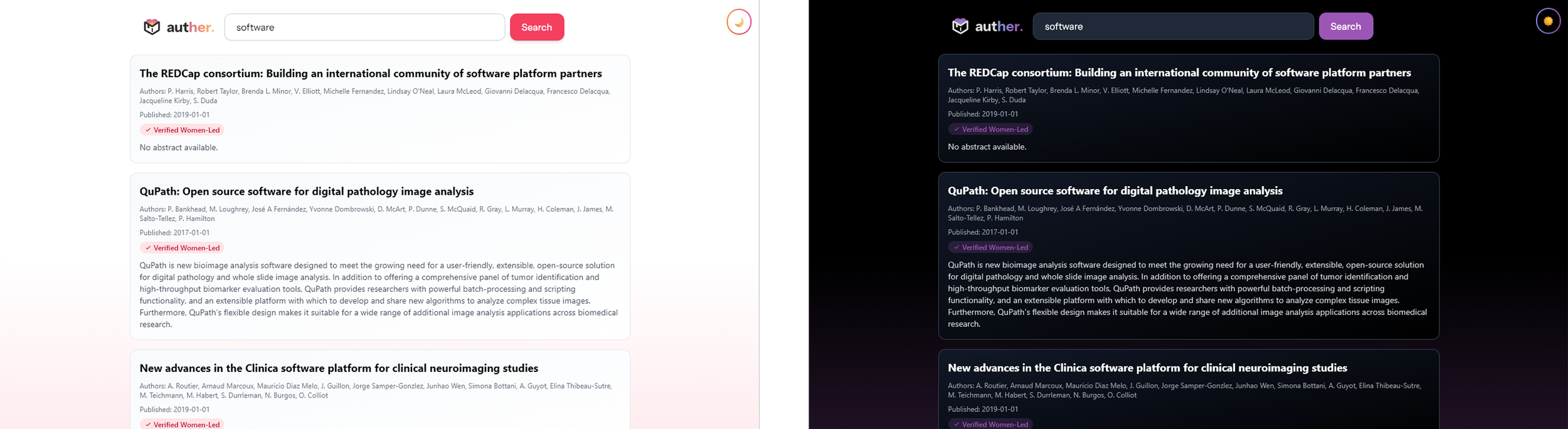
However, due to technical feasibility, we decided to implement the core flows: home and search, leaving other extra flows to be implemented if there was extra time. Once the mockups for each feature were complete, I handed them off to our developer, providing guidance on the UI.
This constraint shaped many design decisions:
I simplified the search interface to reduce development complexity.
I used consistent card layouts
I communicated my designs with the developer and shared components to help speed up build time.
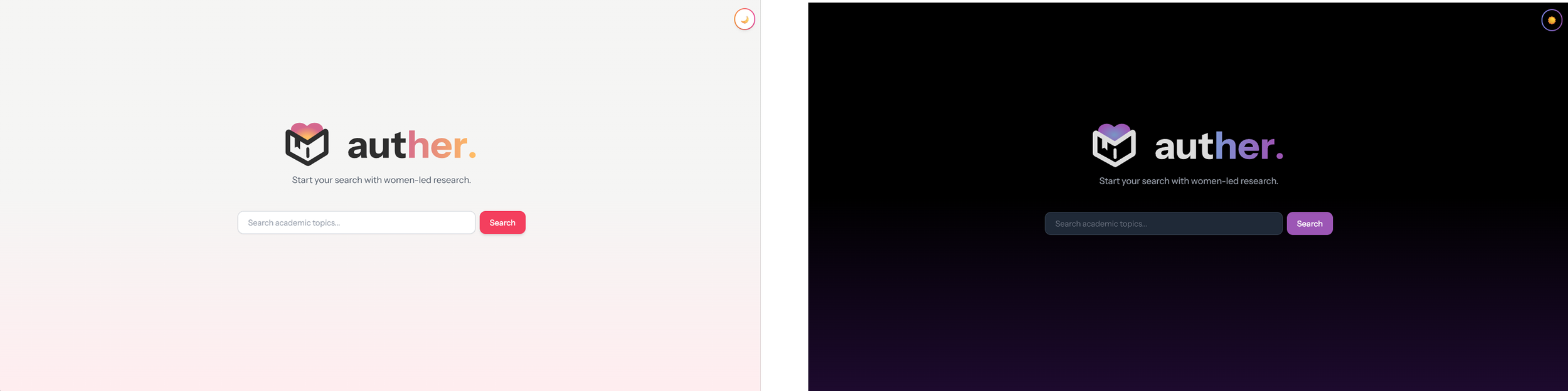
Home Page
Initial Mockups
Light Mode
Dark Mode
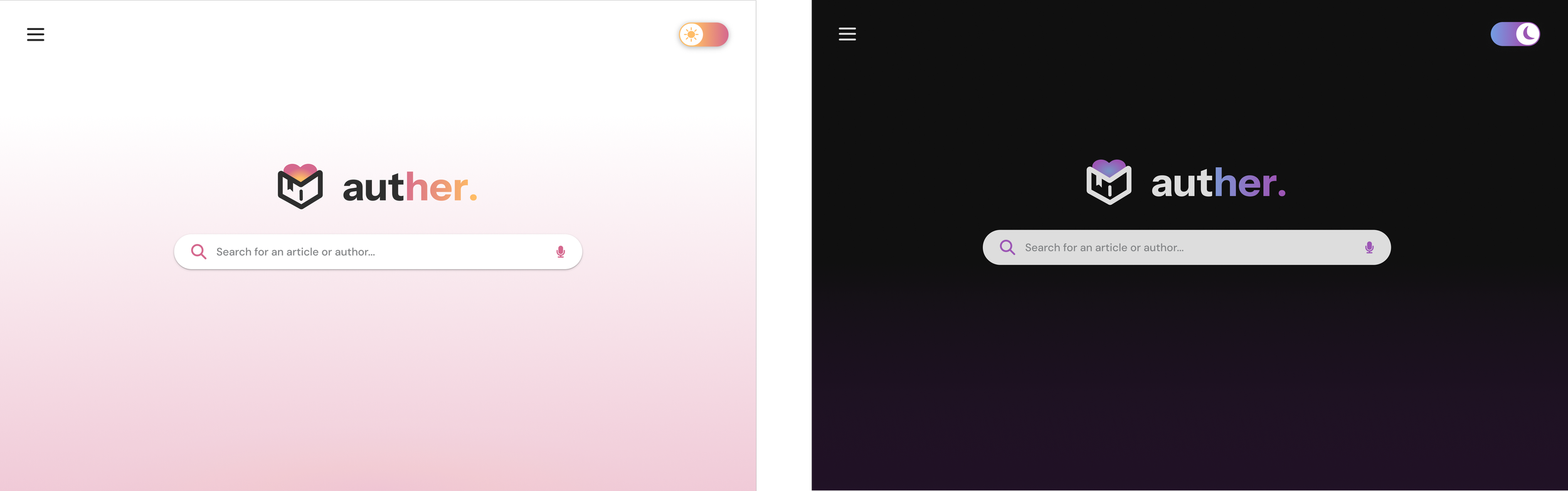
Home Page
Final Implemented Design
Light Mode
Dark Mode
Search Page
Initial Mockups
Light Mode
Dark Mode
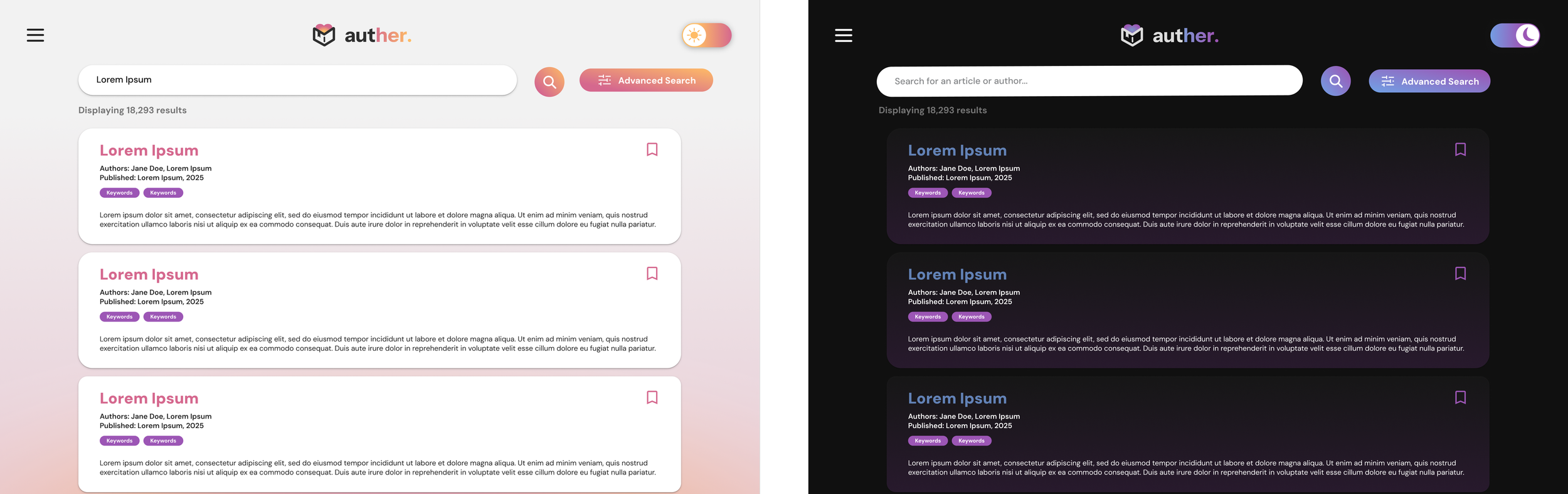
Search Page
Final Implemented Design
Light Mode
Dark Mode
EVALUATING THE PRODUCT
Presenting our product to judges: bringing auther. to life
To pitch auther. to the judges, I helped prepare a pitch and visual presentation for the judging round. To make our demo compelling during our presentation, we highlighted:
Our research & how the problem impacts women
Inequities our platform addresses and impact on empowering women in research
Our platform’s core visuals, features, and functionalities
Our mission and how auther. elevates women-led research
What I learned from my first hackathon experience!
Taught someone something new: by mentoring a teammate in Figma.
Adapting and contributing under uncertainty: I was able to adapt and contribute where I could add the most value despite limited coding experience.
Rapidly iterated on visual designs: developing branding and mockups, including logo, color palettes, and typography, compiling the Devpost, presenting and pitching our product to multiple judges.
Hands-on collaboration with a developer & balancing design ideas with technical feasibility: I practiced handing off designs, clarifying details, and offering flexible alternatives when time was tight.
Screen calibration affects perception: my designs looked perfectly balanced on my laptop but appeared much darker on other displays.
Captured Moments from VenusHacks 2025!
-
![A group of five young people sitting around a table in a conference room, with laptops and drinks, smiling and making heart shapes with their hands.]()
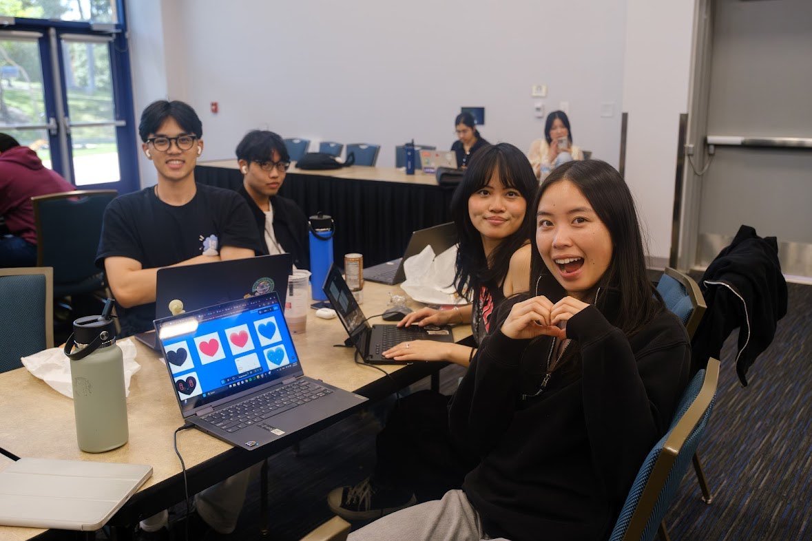
VenusHacks Day 2!
-
![Group of young people gathered around a table with laptops, engaging in discussion during an event or workshop in a large conference room.]()
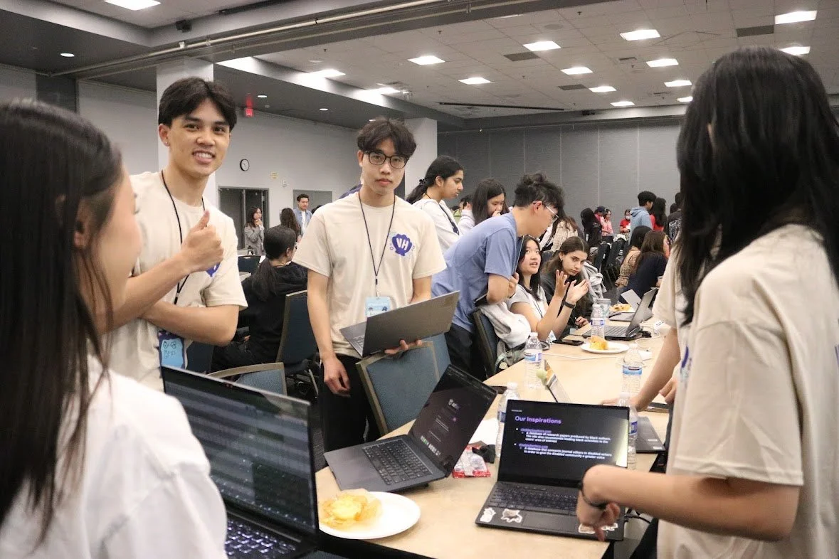
Presenting and pitching auther. to one of our judges.
-
![Four young people sitting at a table, proudly showcasing laptops displaying the brand 'authen' at a busy indoor tech event or conference.]()
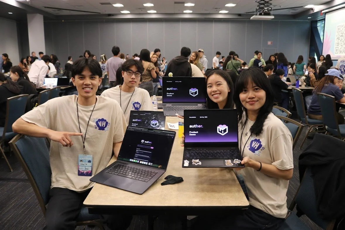
Presenting auther. during the judging panel!
-
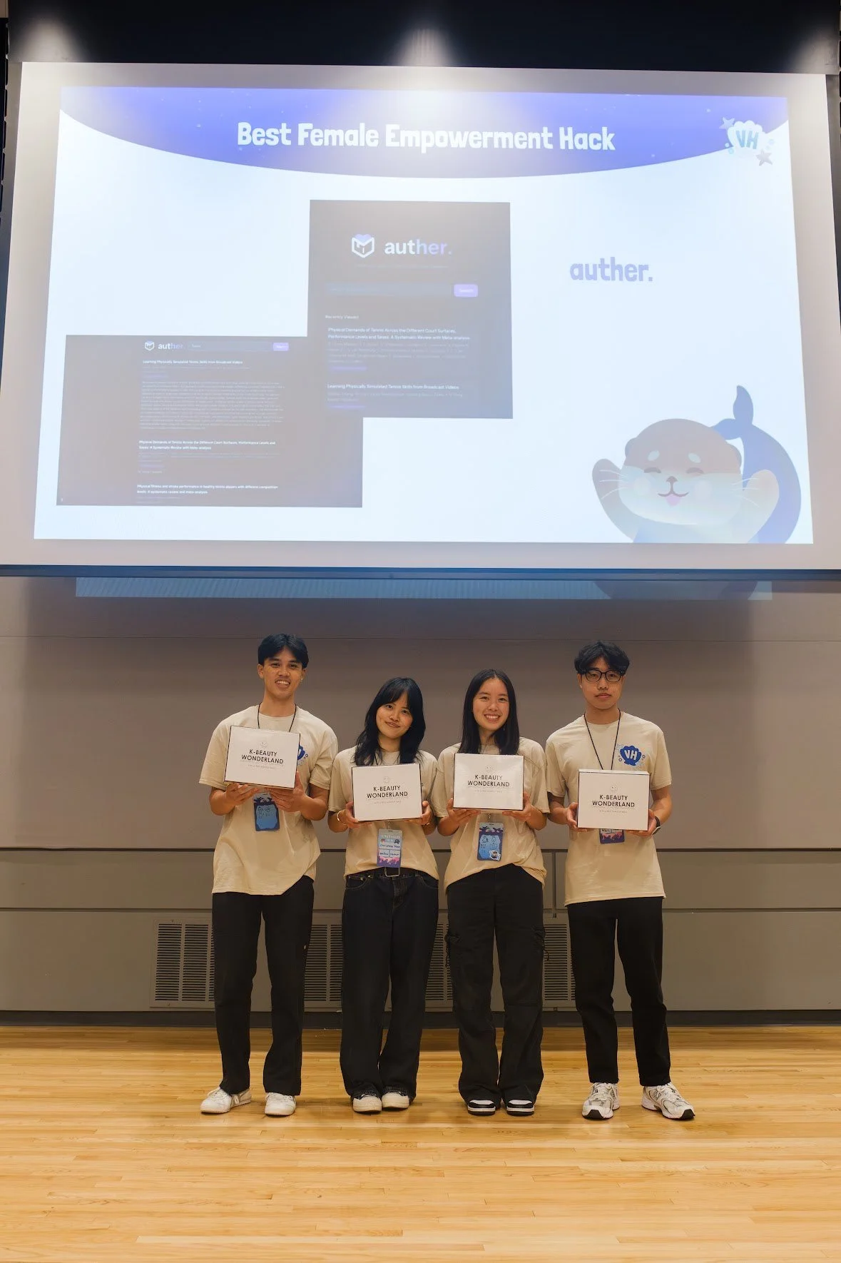
![4 team members with matching clothing pose with their Hackathon prizes.]()
Celebrating our win with prizes at VenusHacks 2025!