

Turning awareness of social causes into action by making volunteering easier to discover, coordinate, and experience with others.
Project Overview
College students care deeply about social and environmental issues, yet many still struggle to consistently participate in volunteer opportunities. Through research, I realized the issue wasn’t lack of motivation. It was the friction between wanting to help and actually showing up.
Derived from “ayuda” the Spanish word for “help”, Yuda is a conceptual mobile app designed to reduce the gap between awareness and action by helping college students discover local volunteer opportunities, coordinate with peers, and stay informed about causes they care about.
During this project, I contributed to user research, synthesis, and the design of key user flows from low-fidelity concepts to final high-fidelity screens. My work focused on translating insights and pain points to explore how digital platforms can reduce barriers to civic engagement.
Duration
Role
Figma, FigJam, User research, User testing, Visual design, Prototyping
The Crew
Lead Researcher
UI Designer
Mar 2025 - Jun 2025
Tools & Skills
Team Leads: Charlotte Huang, Catie Xun
Webmasters: Sherry Tram, Elise Alinsug
Participation Advocates: Evelyn Jiang, Jennellee Samkhem
Lead Researcher: Lana Wang
Scribe: Raquel Peña
THE PROBLEM
College students often care about social, environmental, and political issues, but participation often broke down before action ever happened.
During interviews, students described volunteering as difficult to plan around busy schedules, transportation limitations, unclear event details, and lack of peer coordination. Many opportunities were scattered across different platforms, making it hard to discover events, understand expectations, or commit confidently.
One participant summarized the problem best:
How might we help college students in Orange County to discover and participate in local volunteering opportunities that connect them to the community issues they care about?
“I want to, I see it, I know this is happening. But I don’t know in what ways I can support these groups.”
— Interview Participant
RESEARCH
We started with a contradiction: young adults care deeply about social issues, but fewer are showing up to volunteer. Secondary research showed that nationwide, young adult volunteer participation has declined from 22.8% to 15.9%. However…
Sources: Do Something Strategic , The Guardian , Double the Donation
91%
Of students care about climate change
80%
Expect their institutions to take action
60%
Of students say they want to be more involved
This gap between intent and action became our main challenge to address.
Understanding where participation breaks down and why students struggle to get involved.
Competitive Analysis
We analyzed 9 volunteering platforms to identify gaps in event discovery, information access, and community features
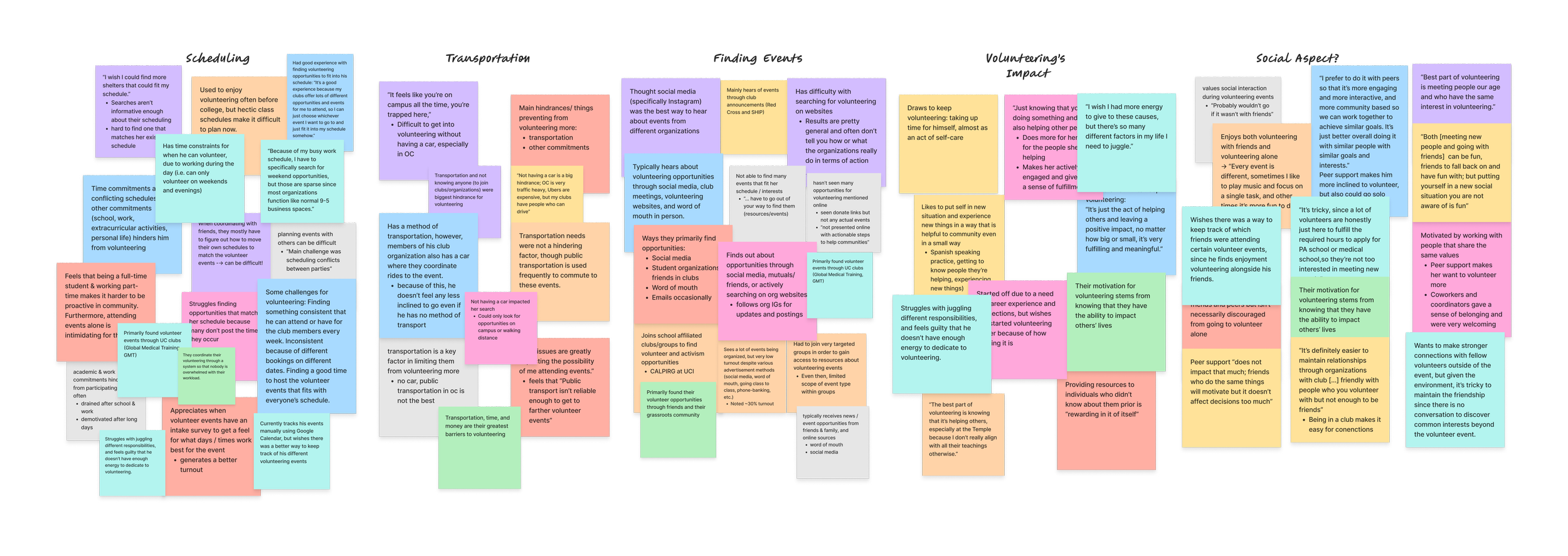
User Interviews
We conducted 9 interviews with UCI students with volunteer experience to understand their motivations and barriers
Volunteering opportunities were somewhat discoverable, but context, awareness, and community were often missing on many volunteering platforms.
While some platforms allowed students to browse volunteer opportunities, discovering the right event and understanding what it involved was often difficult. Search tools were limited, event details were unclear, and opportunities to connect with other volunteers or stay informed about causes were rare.
What we learned from speaking with students
Initially, I assumed event discovery was the main challenge. However, after speaking with students, I realized the larger issue was uncertainty due to logistical friction, making volunteering feel difficult to commit to.
Students seek opportunities that align with their personal values, professional growth, and the chance to connect with like-minded peers.

Logistical barriers and limited guidance hinder volunteer participation.
Vague descriptions, transportation challenges, and limited news about local issues and ways to help prevent students from converting interest into attendance.

Students were drawn to opportunities that felt meaningful and connected them with others
Students rely on social media and clubs to discover events, and manually track events using Google Calendar or Google Sheets.

Event discovery & tracking events needs improvement
“Ride issues are greatly impacting the possibility of me attending events…Public transport isn’t reliable enough to get to farther volunteer events.”
“It feels like you’re on campus all the time, you’re trapped here,”
IDEATION
Students needed more than volunteer listings — they needed a clearer way to discover and track opportunities, stay informed about causes they care about, and take action with others.
To address these, we defined 3 principles and began brainstorming solutions to address these barriers students face:
Make action visible, immediate, and accessible
Reduce logistical uncertainty and ambiguity
Make volunteering social, not solitary
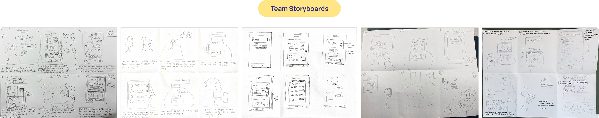
I explored how a user would discover & participate in opportunities through storyboarding
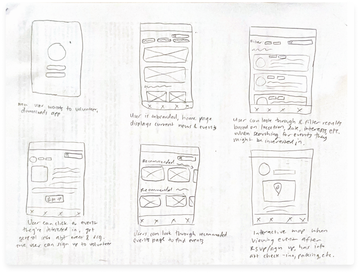
I created a storyboard mapping how users would:
Discover and filter for volunteer events on the home feed
Sign up for an event and view logistic details
View recommended events
INFORMATION ARCHITECTURE
Structuring a feature-heavy experience around how students move from awareness to action
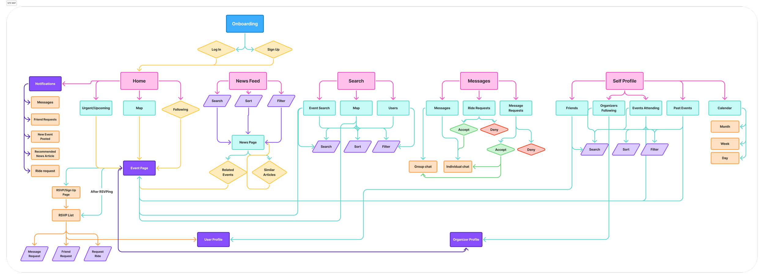
After mapping the core user flows, we defined the structure of our platform to better support these interactions. Our information architecture organized the experience into 5 primary areas: home, search, news, messages, and user profiles.
DESIGNING A SOLUTION
From research to exploring early design concepts for discovery, news, messaging, profiles, & rideshare.
After defining Yuda’s core areas, we moved into low- and mid-fidelity explorations for the features students needed most: discovery, news, messaging, profiles, calendar planning, and rideshare coordination.
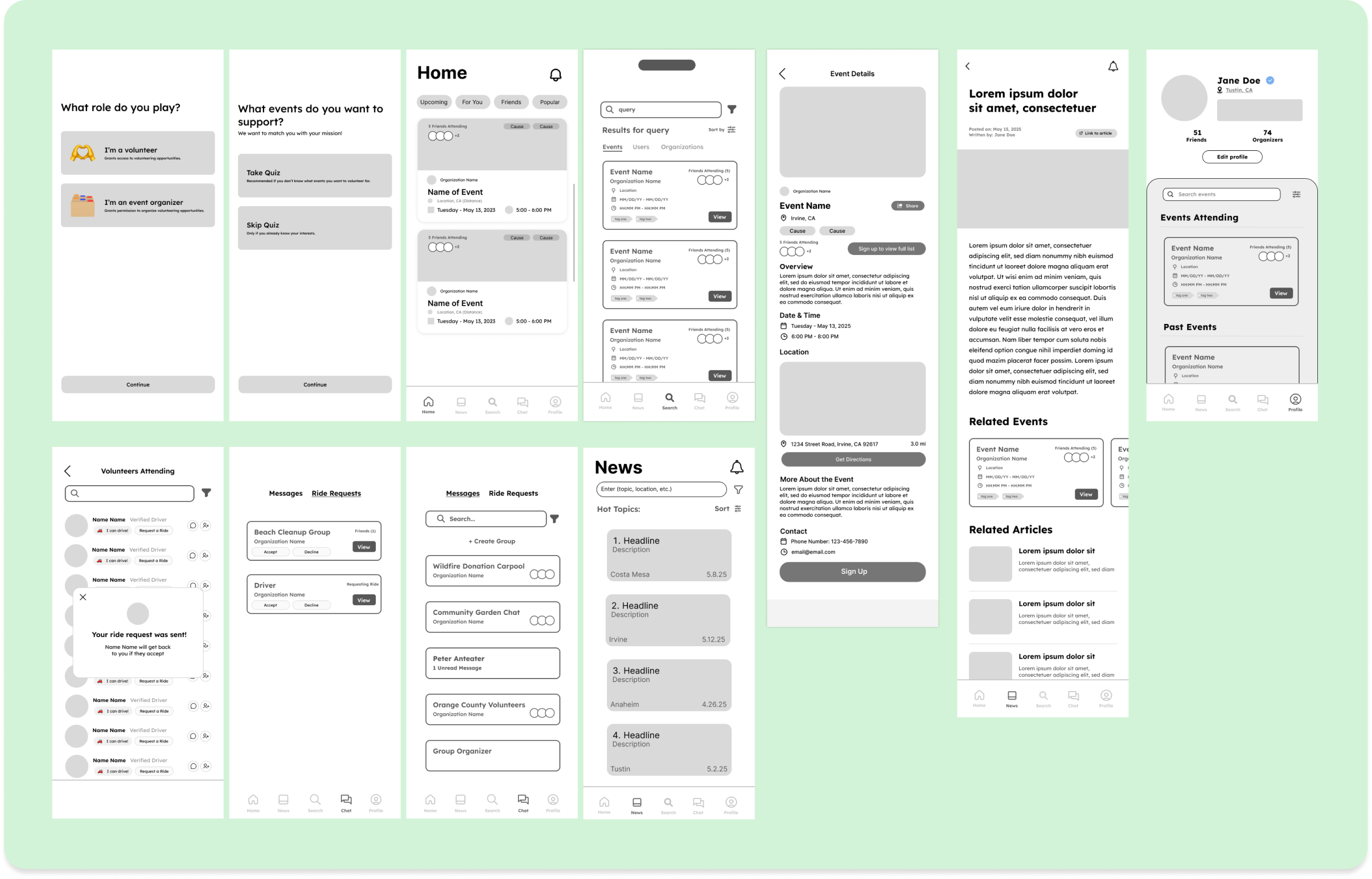
My task: design for users and organizations to support participation and manage connections.
Since profiles needed to support event tracking, peer connection, and organization discovery, I explored familiar social platform patterns and explored several layout options for organizing events, connection, and activity and shared them with our team for feedback.
Several Low / Mid fidelity screens based on each of our proposed features
What wasn’t working
My initial concept used a scrollable overlay to display event details, but early feedback revealed several usability issues:
There is no breathing room
Users had to scroll excessively to look for events
Calendar wasn’t easily accessible
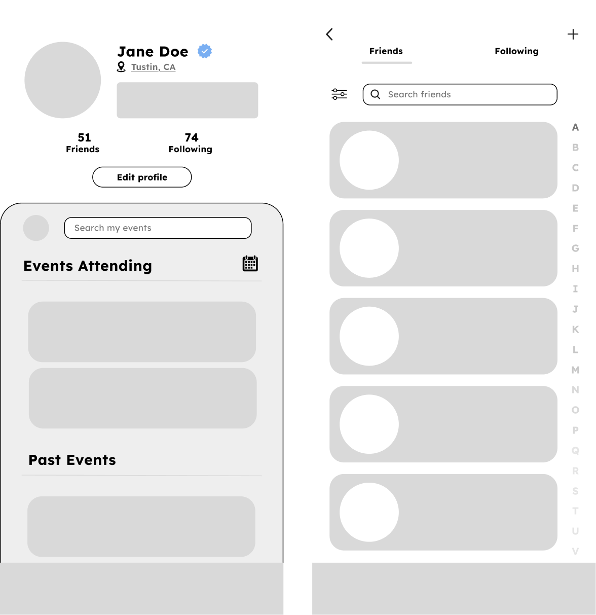
Before: Initial lo-fi profile designs
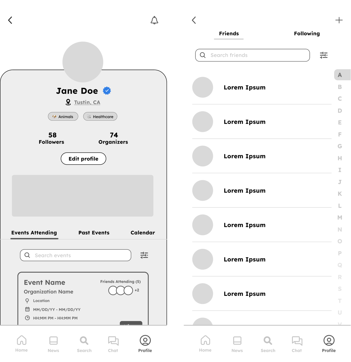
How I improved it
I redesigned the page to improve clarity and navigation by introducing:
Clearer visual hierarchy
Tabbed sections to view events
Volunteer interest chips
A more accessible calendar entry point
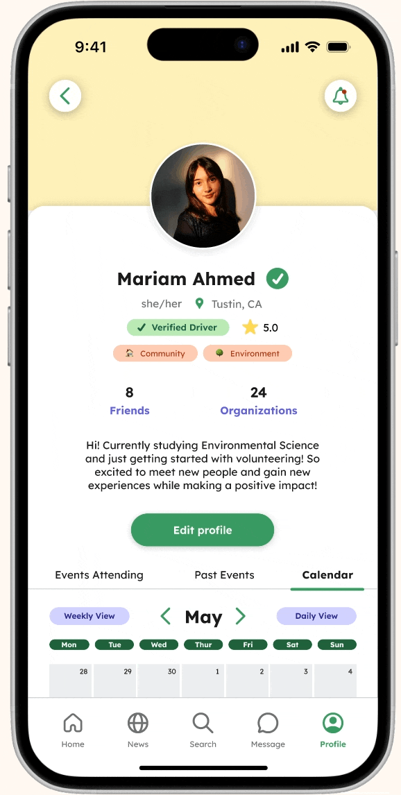
High-fidelity: Helping students feel confident connecting with peers and organizations.
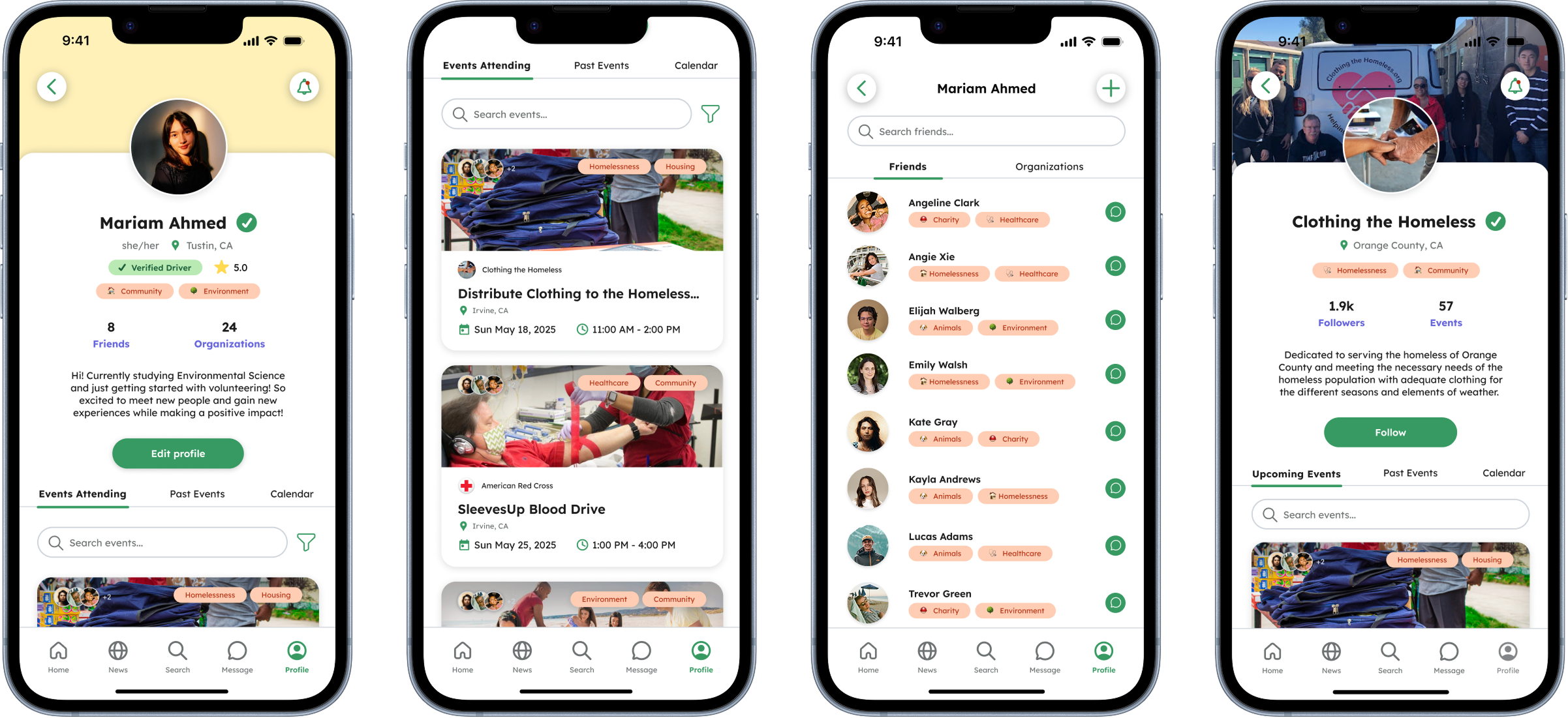
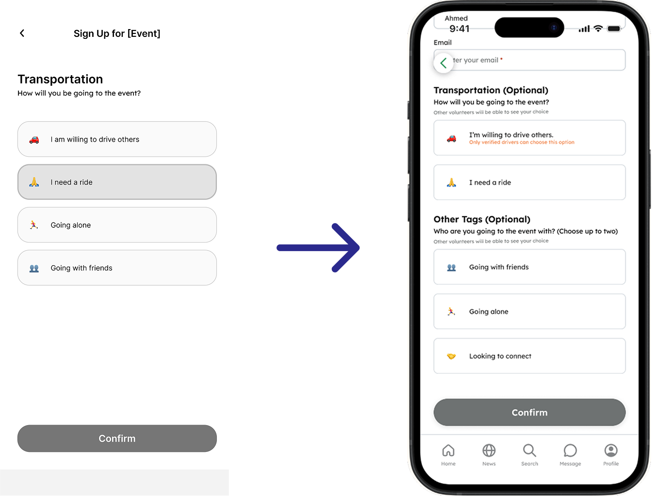
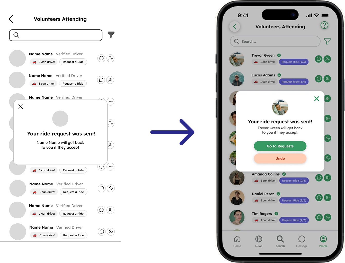
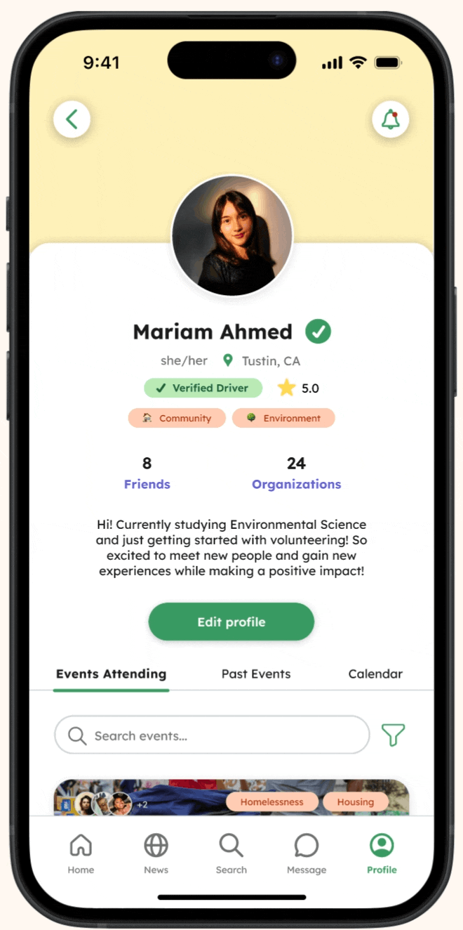
I received feedback from the team to have clearer indication of trust signals for drivers, adding review ratings and an additional chip indicating verified drivers when translating the mid-fidelity frames into high-fidelity.
Updated high-fidelity Profile pages
After: Refined mid-fidelity profile designs
EVALUATING OUR SOLUTION
We conducted a heuristic evaluation to identify moments where users might hesitate, feel confused, or lose control while moving through the experience.
3 major issues emerged with our app’s design, though time constraints prevented us from implementing all changes immediately, these insights guided the design of our high-fidelity prototypes later in the process.
Limited cancellation options for ride requests, event & calendar sharing, event sign ups
Inconsistent undo & back buttons
Lack of Error Prevention
New users are left without clear support when navigating the app for the first time.
Weak Recovery & Feedback
Canceling requests, editing calendar events, and returning to pages lacked clear recovery.
No Help & Documentation
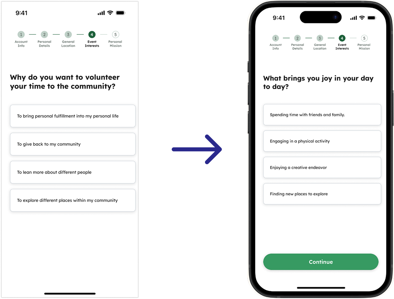
Preventing input errors during onboarding
I introduced a Continue button with a disabled state that activates once the user selects an option to prevent incomplete inputs and guide users.
Reducing friction in event sign-up
We looked for moments where students might hesitate or drop off. One key refinement was simplifying event sign-up into a single scrollable form, with a disabled button state to prevent incomplete submissions.
Improved user control over ride requests
I added an option to undo a ride request and a direct path to view pending requests, giving students clearer control and an easier way to track their status.
EVALUATING THE EXPERIENCE
We conducted 9 think-aloud usability testing sessions with UCI students across 8 core tasks that reflected real-world scenarios.
Usability testing showed that participants navigated pages smoothly, validating the overall structure of my design. At this stage, I helped synthesize feedback across other features to ensure the overall app experience felt consistent. Participants responded positively to core features, describing them as convenient, intuitive, and visually engaging, though a few navigation issues were identified in specific flows.
Design challenge: Bringing the final prototype together under time constraints = delegation.
After user testing, our team had limited time to refine several unfinished flows before final delivery. I took the lead on polishing the calendar, rideshare, and messaging experiences, using participant feedback and our shared design patterns to improve interaction clarity, visual consistency, and overall cohesion across the prototype.
KEY INSIGHTS
Participants had trouble navigating through our app without initial assistance.
-
![]()
Problem: inconsistent interactions made the user experience confusing
Filters behaved inconsistently across Search and News pages, navigating through multiple screens rather than interacting with the filters directly.
-
![]()
Solution: simplifying interactions to match familiar experiences
I replaced the pop-up with a bottom sheet to create a more intuitive filtering experience and simplified the search flow so users can explore causes with just a single tap.
-
![]()
Problem: navigating initially required some assistance
Navigating key features felt overwhelming without some assistance for first time users
-
![]()
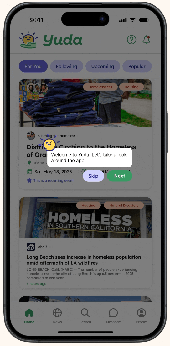
Solution: tutorial during onboarding & help button
Added an onboarding tutorial and help page which can be accessed through a question mark icon to help users navigate through the app with ease.
-
![]()
Problem: users struggled to navigate the calendar
Users struggled finding and navigating through the calendar and had difficulty sharing events.
-
![]()
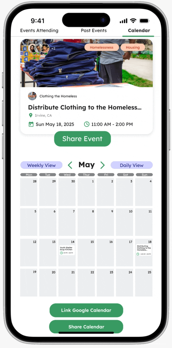
Solution: making the calendar more user-friendly
I redesigned the calendar experience to be more familiar and intuitive, letting users view and share events without leaving the page
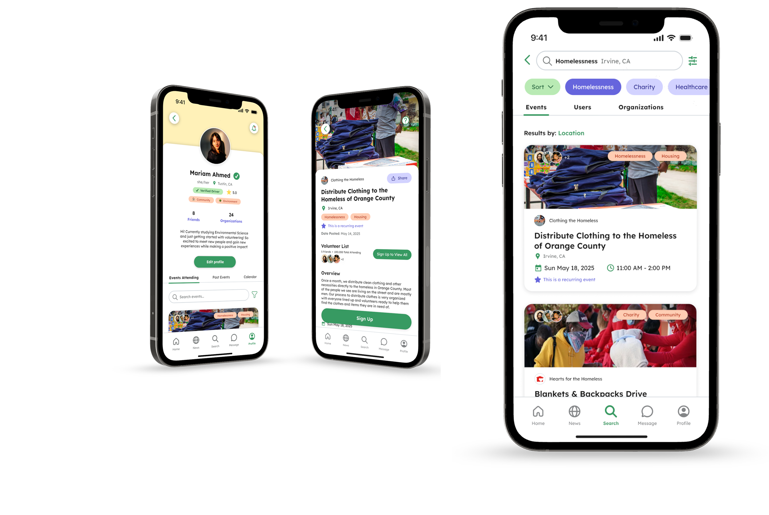
Introducing…Yuda!
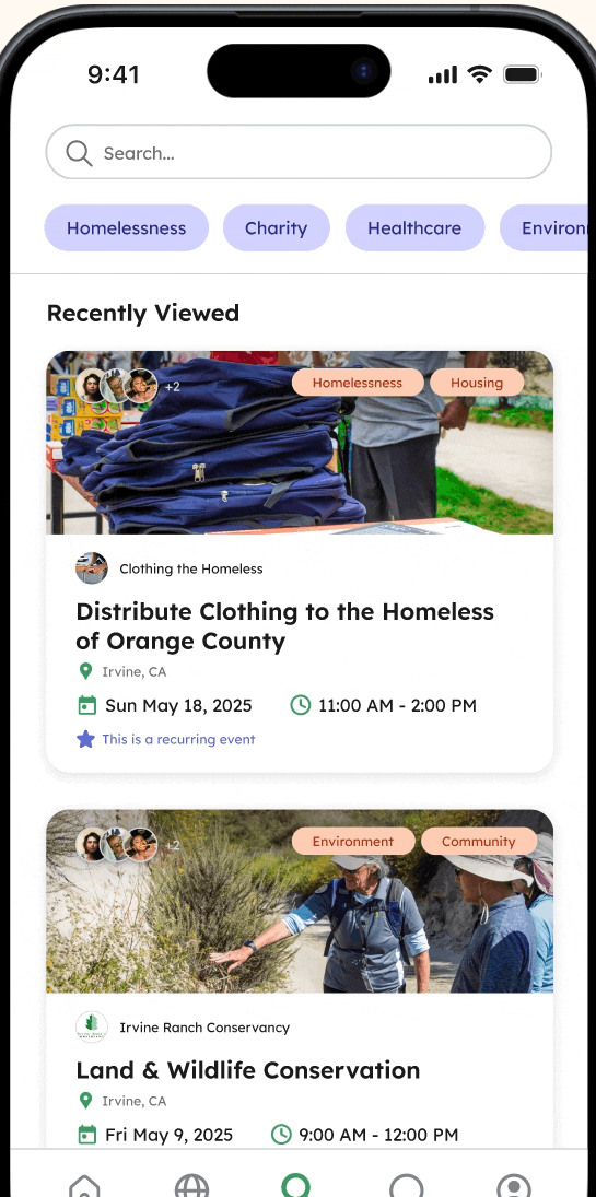
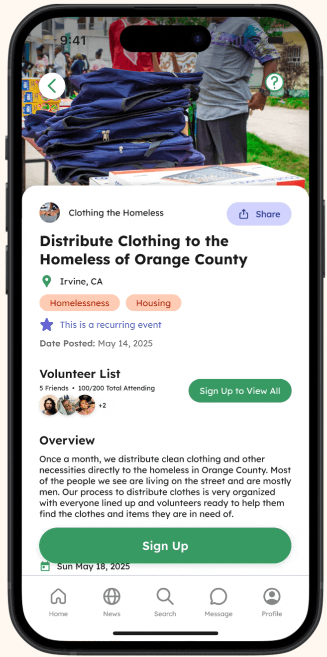
FEATURE #1: SEARCH & FILTER
Easily discover volunteering opportunities.
Explore organizations, people, and opportunities that align with your passions, whether it's environmental action, education, or community building.
FEATURE #2: RIDESHARE
Don’t have a ride? No problem!
Request a ride from other volunteers, review driver details, and track their pending requests, all in one place.
FEATURE #3: CALENDAR
Track & share events with friends.
Track past and upcoming events through your profile and share them with friends to stay connected and organized.
Stay connected with peers & organizations.
Stay informed about your community by connecting with peers and organizations to stay updated on causes you care about, events, and volunteer opportunities.
FEATURE #4: PROFILE
KEY TAKEAWAYS!
What I learned.
Seeing the process from start to finish over 10 weeks was incredibly rewarding. Working with a large team for the first time felt intimidating at first, but it pushed me to grow outside of my comfort zone.
Within these 10 weeks, I learned how to prioritize key interactions, embrace feedback, iterate quickly, and support design decisions across the project. Going through the full cycle of the Double Diamond process, prototyping, testing, and refinement gave me a deeper appreciation for user-centered design and its impact..
It’s Okay to Ask for Feedback!
Asking for feedback felt intimidating at first, but embracing it early made my designs stronger and helped me move faster, especially under tight time constraints!
Prioritization > Perfection!
I learned how to prioritize core interactions, iterate quickly, and make decisions based on user needs rather than sweating the small details.
Teamwork Matters!
Working with 9 teammates pushed me to communicate through weekly syncs, align quickly, and help members learn Figma to keep our project cohesive!
-
Keeping Our Designs Cohesive and Consistent: With multiple designers contributing to multiple complex features, we had to align on patterns and components early.
Balancing Complexity of Our Features: Designing many features while keeping the experience simple required frequent iteration and simplification. We had to rethink and redesign and fix prototypes across multiple screens, focus on the most important interactions, and lean into familiar patterns so students wouldn’t feel overwhelmed.
Figma Learning Curve: I supported teammates who were newer to Figma by guiding them through prototyping tips, creating templates, and shared components to streamline our workflow.
-
I gained hands-on experience with user-centered design through contextual interviews, creating context scenarios and storyboards, performing cognitive walkthroughs, and iterating on prototypes through usability testing to deliver an initiative, student-focused app.
We approached our project using the Double Diamond process. Our team initially diverged and explored possibilities and pain points through research, then converging and narrowing our focus to define our problem and come up with a definitive solution.
Iterating based on user and team feedback became central to our approach. Each refinement brought us closer to creating an intuitive and user-friendly final product.
-
With more time I would…:
Conduct additional usability testing sessions with more students from different majors, schedules, and tech comfort levels to uncover edge cases and further refine flows.
Enhance accessibility and personalization, making the app more inclusive and tailored to user preferences, such as notifications for new events based on user interests.
Explore more social features to make volunteering more engaging and encourage participation, such as interest-based volunteer circles.
Try out the prototype for yourself by interacting with the phone!
Over the course of 10 weeks, our team designed a platform that helps students easily discover volunteering opportunities and make friends, turning volunteering into a fun and rewarding experience.
Our final prototype brings together several core features based on our research findings. I'm extremely proud to have contributed to this project and delivering a cohesive, user-centered product within 10 weeks!